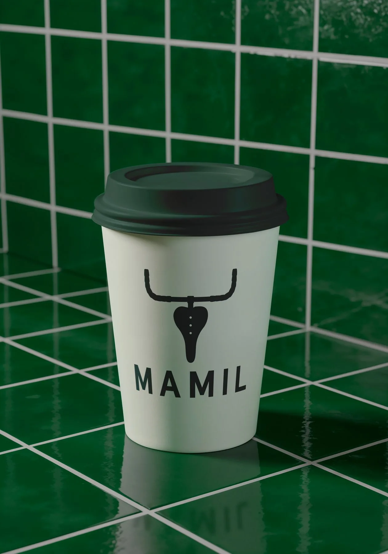
MAMIL
Branding, experiential and menu design for a small chain of cycling cafes.
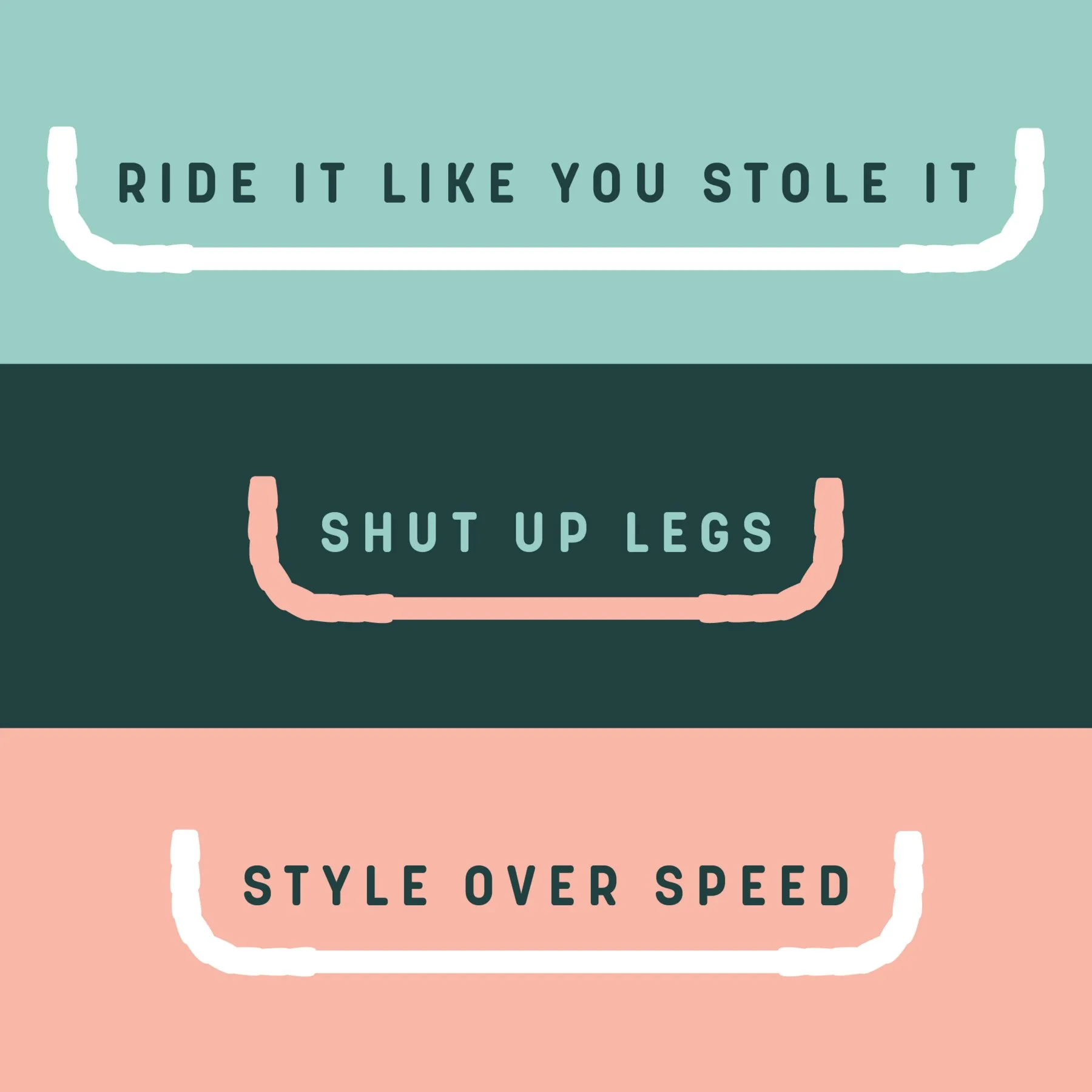
Approached in 2021 by Dave, a keen cyclist with a long history in the catering industry, the brief was to create a brand identity for a cafe with a cycling theme. Cycling culture is notoriously stylish and steeped in the history of famous European races — the cafe needed to reflect this while maintaining a touch of humour and self-awareness.
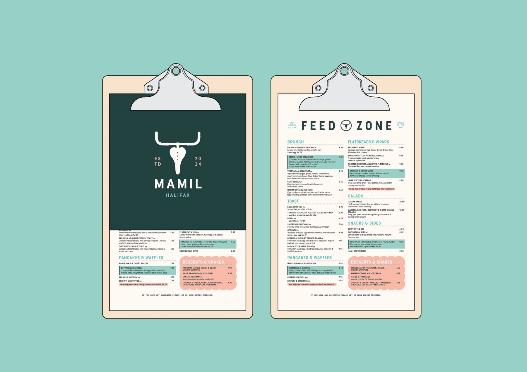
Working closely with the client, the brand played off the often derogatory term for cyclists: the Middle Aged Man in Lycra, or MAMIL. The logomark references the cycling connection subtly, without being exclusive to cyclists.
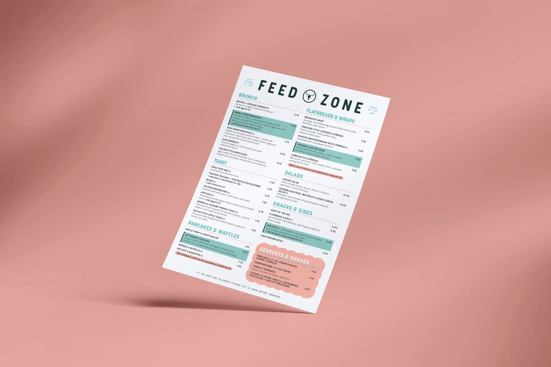
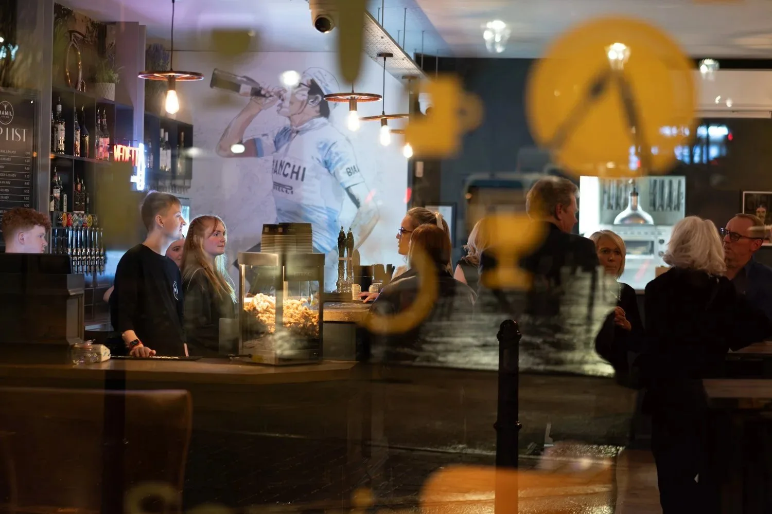
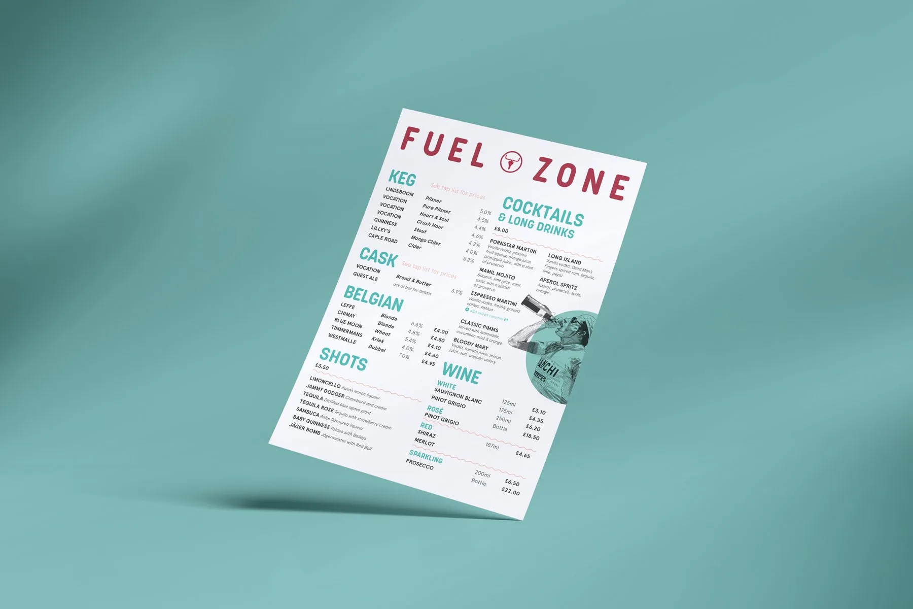
The menus introduced secondary fonts and colours to avoid an overly oppressive, monotone look. Wall murals utilising the handlebars motif mingled with framed jerseys and homages to icons of cycling to give each cafe a real 'clubhouse' vibe.
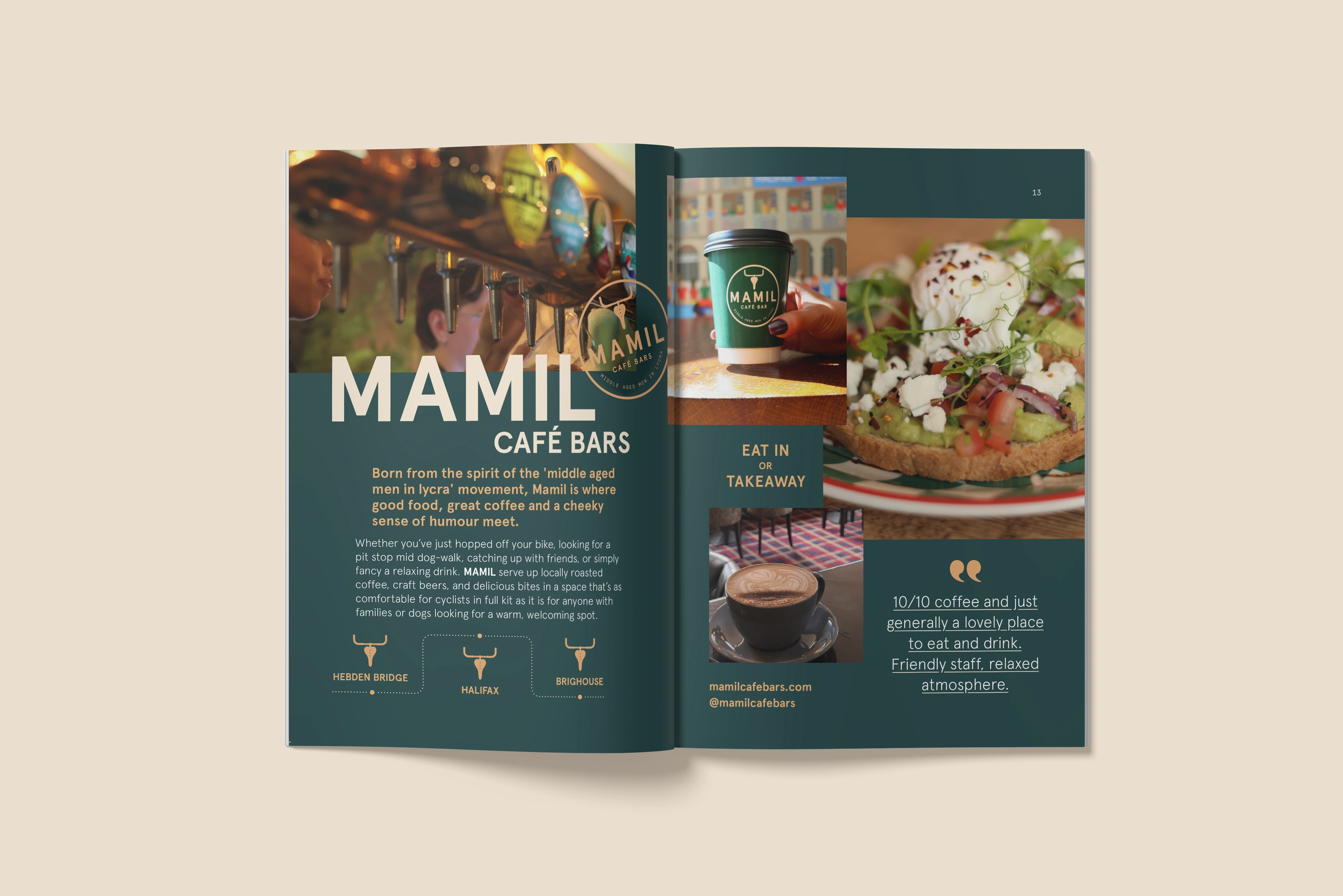
Mamil went on to open a further two bars, all following this same visual identity — helping them achieve success and brand recognition across Calderdale.